Adding Widgets
Every tab you can edit shows an Add Widget button in the upper-right of its widget area. Clicking it opens the widget picker.
Picking a widget type
The picker is organized into four category tabs: Custom, Inventory, Tickets, and Billing. The Custom tab holds the six widgets you can fully configure; the other three hold pre-made widgets that drop in with sensible defaults.
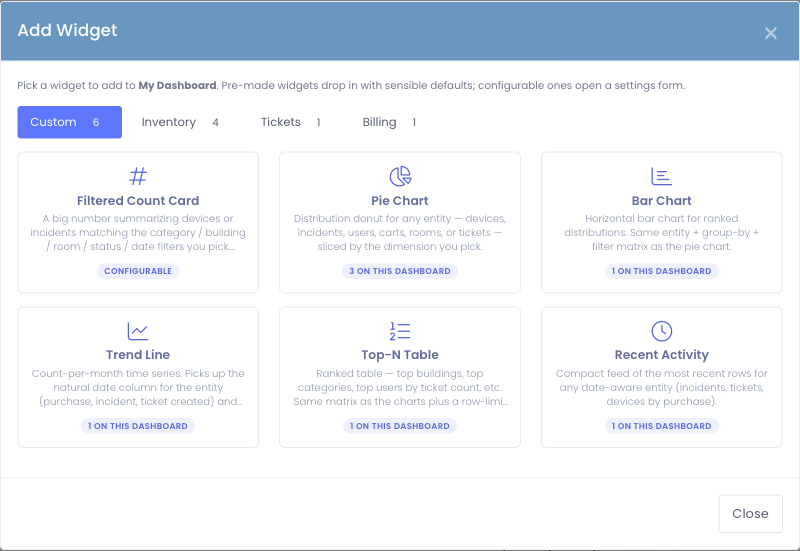
Clicking a card:
- A configurable widget swaps the modal to its settings form. Fill it in and click Save.
- A pre-made widget drops onto your dashboard immediately and the picker closes.
If you click the wrong card, use the ← Back to widget picker link at the top of the settings form to return to the gallery — you don't have to close and reopen the modal.
Configuring a widget
Configurable widgets all share the same form layout so you only learn it once.
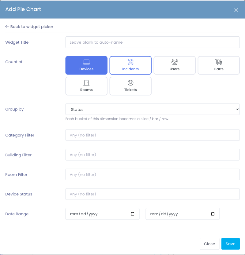
1. Widget title (optional)
Leave blank to use an auto-generated title like Tickets by Status or New Incidents — Last 12 Months. Type your own if you want something specific to your audience.
2. Count of (the entity)
Pick what the widget counts. Available entities depend on which modules your district has enabled:
- Devices — every inventoried device
- Incidents — device damage reports
- Users — staff and students
- Carts — cart records
- Rooms — room records
- Tickets — Support Center tickets
The radio strip only shows entities your installation supports. If your district doesn't use the Support Center, for example, Tickets won't appear.
3. Group by (pie / bar / Top-N only)
Each entity offers a different set of slicing axes:
| Entity | Group-by axes |
|---|---|
| Devices | Status · Category · Building · Room |
| Incidents | Status · Building · Reported by (Staff vs. Student) · Location (On / Off School Property) |
| Users | Building · Grade Level · Staff vs. Student · Active vs. Inactive |
| Carts | Building · Room · Capacity (size bucket) |
| Rooms | Building · Floor |
| Tickets | Status · Priority · Department · (your department custom fields) |
Changing the entity automatically narrows the group-by options to the ones that make sense for that entity.
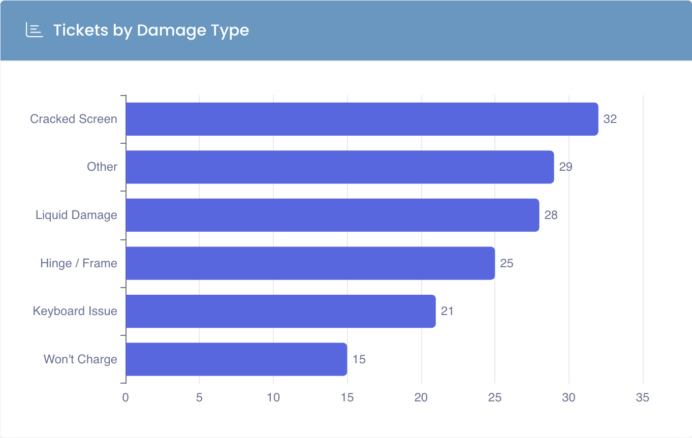
When you choose Tickets, the Group by list also includes each Support Center department's own dropdown and checkbox custom fields — for example a "Damage Type" or "Issue Category" question. They appear labelled with their department, like Damage Type (Device Repairs), so you can pick the right one when two departments use similar names.
Grouping by a custom field slices the chart by the answers your technicians actually selected, turning that free-form data into a clean breakdown (Cracked Screen, Liquid Damage, Won't Charge, …). Only tickets that carry an answer for that field are counted.
4. Look back (trend line only)
Choose how many months of history the trend line should cover — 3, 6, 12, 18, 24, or 36. The chart bins counts by month and pads empty months with a zero baseline so the line never breaks.
5. Rows to show (Top-N and recent activity only)
Pick how many rows the table or feed should display: 5, 10, 15, 20, or 25.
6. Filters
The filter cluster reconfigures based on the entity you picked. Each filter is optional — leave it blank to skip filtering on that dimension.
- Category Filter (Devices, Incidents) — picks specific device categories, rolling up subcategories
- Building Filter (most entities) — narrows to one or more campuses
- Room Filter (Devices, Carts) — narrows by room
- Device Status / Incident Status / Ticket Status (matching entity only) — narrow by status value
- Priority Filter (Tickets) — Low, Medium, High
- Department Filter (Tickets) — Support Center department
- Active Status (Users) — Active, Inactive, or any
- User Type (Users) — Staff only, Students only, or any
- Date Range (date-aware entities) — From / To dates that narrow the population
Filters apply identically across every widget type for that entity. A Pie Chart and a Count Card for Tickets · Priority=High · Department=IT count the exact same rows.
Saving
Click Save at the bottom of the modal. The widget drops onto your tab at its default size and you're returned to the dashboard.
Adding a pre-made widget
Pre-made widgets (Quick Stats, Campus Summary, Loaner Devices, Licensing Info, Support, and Recent Unpaid Invoices) skip the form entirely.
- Click the card in the picker.
- The widget drops onto the dashboard immediately and the picker closes.
- If a pre-made widget is already on this tab, the card shows an Added badge and clicking it does nothing — pre-made widgets are one per tab.