Widget Types
This page is a tour of every widget you can pin. Use it when you're deciding which widget answers the question you want on your dashboard.
Configurable widgets
Six widget types take a settings form so you can point them at any entity (Devices, Incidents, Users, Carts, Rooms, Tickets) and filter the population down to exactly the slice you care about.
Filtered Count Card
A big number summarizing how many items match your filters.
Use it when the answer is a single integer: Active devices, Open tickets assigned to my team, Lost devices at Lincoln Elementary. The number's color hints at the entity — devices/carts are brand-blue, incidents/tickets are amber, users are green, rooms are info-blue.
Pie Chart
A distribution donut, with one slice per bucket of your group-by.
Use it when proportion matters more than ranked order — how does our ticket queue split across statuses?, what percentage of devices are still under warranty by category? The legend shows every slice with its count and percentage.

Bar Chart
The same data as a pie chart, drawn as a horizontal bar so the largest values land at the top and exact counts are easy to read off the right edge.
Use it when ranked order is the story — which buildings have the most incidents?, which categories have the most active devices?

Trend Line
Counts per month over a look-back window of 3 to 36 months. Empty months are padded to zero so the line never breaks.
Use it for direction questions — are device purchases trending up?, are incidents spiking in October?, are tickets dropping after the new procedure rolled out?

Top-N Table
A ranked table of the largest buckets with exact counts. You pick how many rows to show.
Use it when you want both the ranking and the precise number — the top five buildings by open incidents, the ten device statuses by count. Same group-by axes as the pie and bar charts.

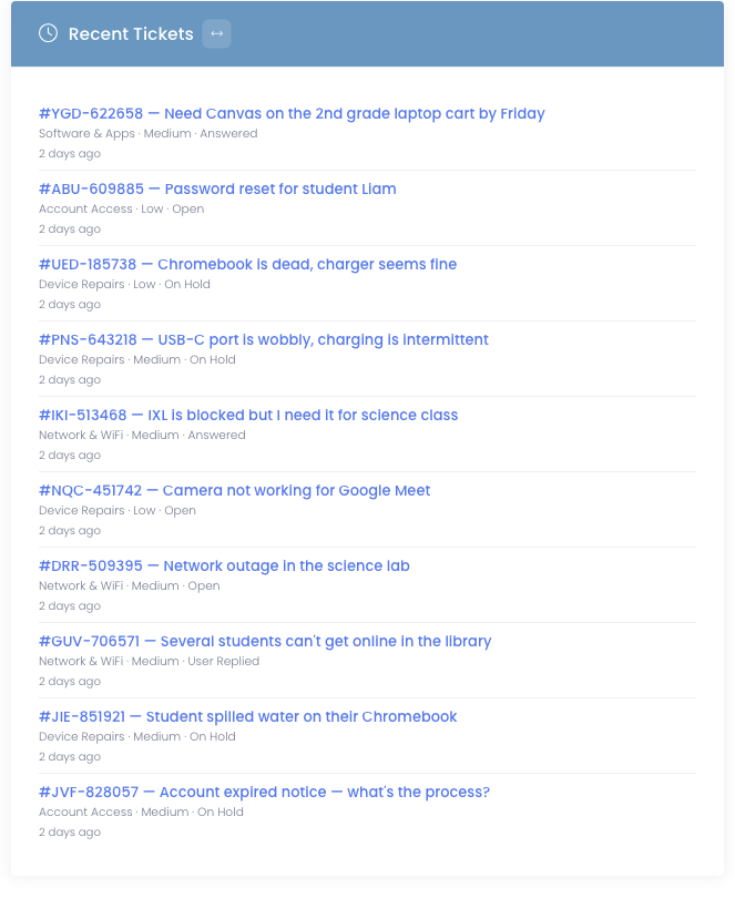
Recent Activity
A feed of the most recent items for an entity, with a link to each one. Most useful for the date-aware entities — incidents, tickets, devices (by purchase date), and users (by created date).
Use it when you want to skim what's been happening lately — the last ten tickets that came in, the most recent incidents from across the district.
Pre-made widgets
Six pre-built widgets drop onto a dashboard with no configuration. They're great for the metrics you always want at the top of the page.
Quick Stats (Inventory category)
Four count cards in a row across the full width: Active Users, Inventoried Devices, Active Incidents, Unpaid Invoices. Click any one to drill into the underlying list.
Campus Summary (Inventory)
Per-campus table of total devices, spare devices, devices in repair, open incidents, and carts. Great as the second row of a building principal's tab.
Loaner Devices (Inventory)
Compact card showing how many loaner devices are checked out vs. available right now.
Licensing Info (Inventory)
Gauge showing how many of your licensed user seats are in use.
Support (Tickets)
Awaiting-reply and assigned-to-you ticket counts plus a list of your most recent tickets, with quick "View All" / "View My" actions.
Recent Unpaid Invoices (Billing)
A sortable, searchable table of the most recent unpaid invoices with quick View / Edit actions per row.
Each pre-made widget is one-per-dashboard. The picker shows an Added badge next to widgets already pinned to the current tab. To put the same pre-made widget on multiple tabs, add it to each tab.