Quick Stats
Quick Stats is an interactive dashboard that gives you a visual overview of your Manage1to1 environment: device damage, incident patterns, fleet status, and billing. It is built for spotting trends, communicating workload, and backing up internal reporting with a picture rather than a spreadsheet.
You reach it from the main navigation under Reports → Quick Stats.
What makes it interactive is that the charts are a starting point, not the end of the story. You can filter every chart at once, click any chart to see the exact records behind it, and download any chart as an image for a presentation.
To open Quick Stats you need the Stats/Exports permission on your role. The Financial section additionally requires the View Billing permission, and the MDM section only appears when an MDM provider is connected.
What your account sees
Quick Stats shows only the buildings your account has access to. If you are assigned to specific schools, every chart, filter, and drill-down is limited to those schools, even the totals at the top. District-wide administrators see every building.
This means two people can open the same page and correctly see different numbers. A building principal sees their school; a district administrator sees the district.
The filter bar
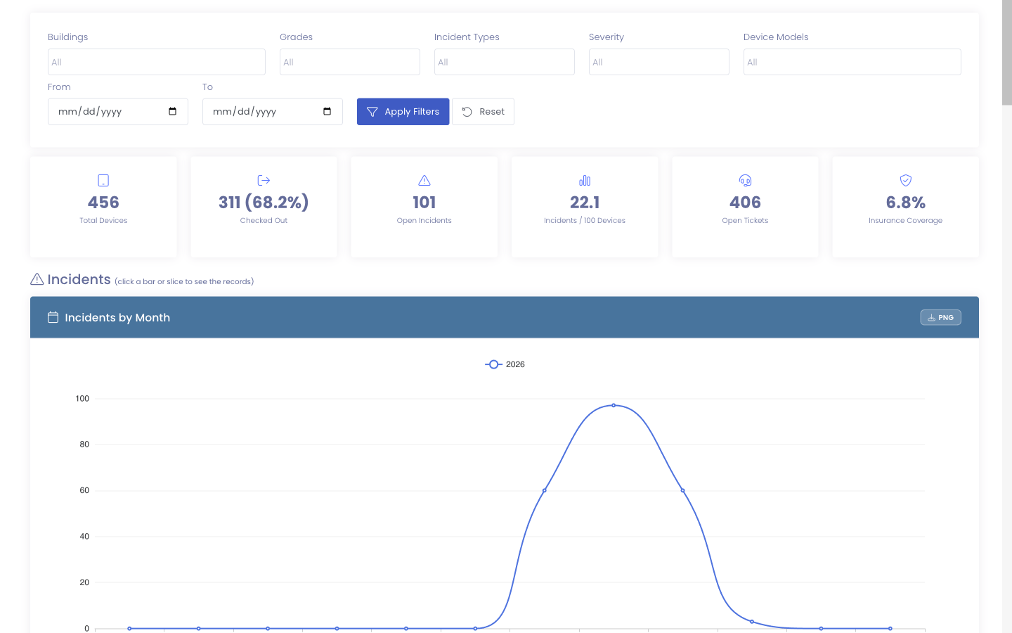
A filter bar runs across the top of the page. Change anything in it and every chart updates together, so you are always comparing like with like.

You can filter by:
- Building - one or more of the schools you have access to
- Grade - one or more grade levels
- Incident Type - the incident flags you use, such as Screen or Liquid Damage
- Severity - how serious an incident is
- Device Type - a device model or category
- Date range - a start and end date
Each of the dropdowns is searchable, and you can pick more than one value at a time. The page opens on the current school year by default, so you see this year's activity without setting anything.
How to use it:
- Choose any combination of filters.
- Select Apply to update the charts.
- Select Reset to clear everything and return to the current school year.
Narrowing to one building, the 6th grade, and Screen incidents answers a very specific question ("how is 6th grade doing on cracked screens at this school?") across every chart on the page at once.
The summary tiles
A row of tiles sits above the charts for the numbers you check most often:
- Total Devices - visible devices in range
- Checked Out - how many are with a user, and what share of the fleet that is
- Open Incidents - incidents still in progress
- Incidents / 100 Devices - a fair rate that lets you compare a small school to a large one
- Open Tickets - support tickets still open
- Insurance Coverage - the share of students carrying an active policy
When you have the View Billing permission, two more tiles appear with the financial charts: Outstanding Balance and Fees Collected.
Three things every chart can do
Before the charts themselves, it helps to know the three actions that work on all of them.
Click a chart to see the records behind it
This is the heart of the redesign. Click a bar, a pie slice, or a point on a month chart, and a window opens listing the exact records that make up what you clicked, with a link to open each one.
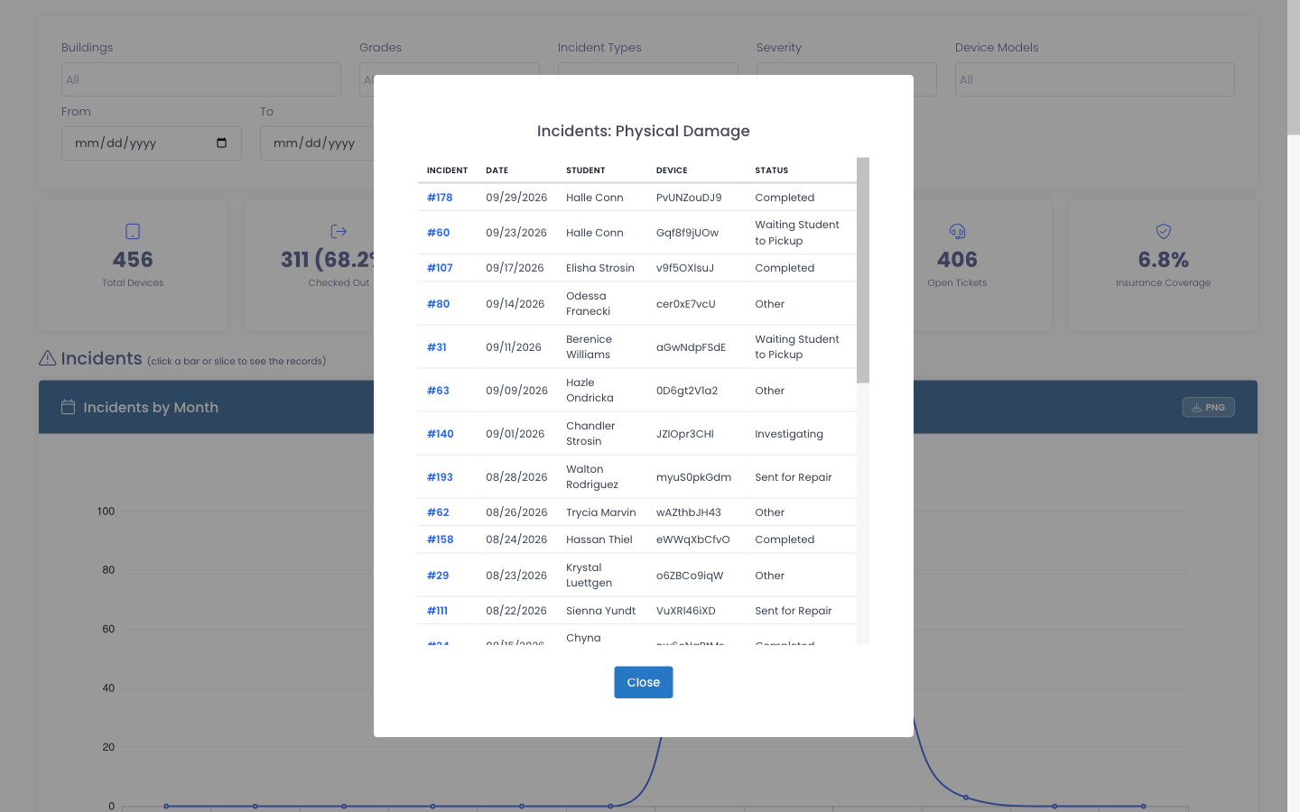
For example:
- Click the Critical bar on Incidents by Severity to list those incidents, each linked to its incident record.
- Click a building on Devices by Building to list those devices, each linked to its device page.
- Click a month on Damage Cost by Month to list that month's invoices.
The window shows the most recent records first and is capped so it stays quick to read. When you need the full set, use View Reports or Exports.
Download a chart as an image
Every chart has a download button in its header. It saves the chart as an image with a Powered by Manage1to1 footer, ready to drop straight into a board deck, a newsletter, or a leadership email.
Light or dark, your choice
The whole page follows the light or dark theme you have chosen for the app, so the charts stay easy to read either way.
Incidents
The Incidents section shows where device problems are coming from.
Incidents by Month
A line for each year showing incidents per month. Use it to spot seasonal patterns (a fall spike as new users settle in), judge whether things are improving over time, and see the effect of a change in policy or training. Click a month to list that month's incidents.
Incidents by Grade
Incidents rolled up into Elementary, Middle, and High bands rather than every individual grade, so the shape is clear at a glance. It tells you which band is seeing the most activity and may need targeted support. Click a band to list its incidents.
Incident Location
A split of incidents that happened on school property versus off it. A heavy lean toward off-campus can point to a conversation with families about care at home. Click a slice to list those incidents.
Incidents by Type
Incidents grouped by the flags you use, such as Screen, Liquid Damage, or Charging Port. The busiest types are shown individually and the long tail is grouped into Other, so the chart stays readable. This is the chart that tells you which repairs to stock parts for. Click a type to list its incidents.
Incidents by Severity
Incidents grouped by how serious they are. It separates the cracked-corner cases from the write-offs so you can weigh workload, not just count tickets. Click a severity to list those incidents.
Repeat Offenders
The people with more than one incident this year, worst first. It is meant for intervention rather than tallying: a short conversation with a handful of students or staff often prevents the next several incidents. Click a name to list that person's incidents.
Fleet
The Fleet section shows the state of your devices.
Checked In / Out
How much of the fleet is currently with a user versus sitting in inventory. The healthy balance shifts with the calendar: mostly out during the school year, mostly in over the summer. Click a slice to list those devices.
Devices by Status
Your devices split across their statuses (active, in repair, retired, and so on). Click a status to list its devices.
Devices by Model
Which models make up your fleet, busiest first with the rest grouped into Other. Useful for planning refreshes and knowing where a new operating system version will land. Click a model to list those devices.
Devices by Building
How devices are spread across your schools. Click a building to list its devices.
Checkouts by Grade
Checked-out devices rolled up into grade bands, so you can see how deployment is distributed and where it is still growing. Click a band to list those checked-out devices.
Device Age (Replacement Outlook)
Your devices bucketed by age, from under a year old through four years and older, with devices that have no purchase date shown as Unknown. It is the chart to open when you are building a replacement budget. Click a bucket to list those devices.
Financial
The Financial section needs the View Billing permission. If you do not have it, this section simply does not appear.
Outstanding Balance and Fees Collected
Two tiles summarize the money side: what is still owed, and what has been collected in range.
Fees Collected Over Time
A line for each year showing fees collected per month, formatted in dollars. Click a month to list that month's payments.
Outstanding by Building
What is still owed, grouped by school, so you can see where collection effort will pay off. Click a building to list its outstanding invoices.
Damage Cost by Month
The cost of damage billed per month, formatted in dollars and grouped by when the incident happened. Click a month to list that month's invoices.
MDM Summary
If you have an MDM provider connected (Google Admin, JAMF Pro, or JAMF School), Quick Stats adds a summary of your managed devices:
- Devices by MDM Provider - how your devices are split across connected providers
- MDM Sync Status - how many devices are syncing normally versus going stale
For the full set of MDM charts, select View Full MDM Statistics to open the MDM Statistics page.
The MDM Summary only appears when at least one MDM provider is connected and syncing.
Putting it to work
- Review on a schedule. A monthly or quarterly look catches a trend while it is still small.
- Compare year over year. The month charts carry more than one year, so this year sits next to last year.
- Start wide, then click in. Read the chart for the pattern, then click the part that stands out to see the records driving it.
- Download for the room. The branded image drops straight into a board deck or a leadership email.
- Filter to your question. Building principals filter to their school; district staff leave it wide for the full picture.
Trends are worth more than any single number. One high month can be noise; three high months in a row is a pattern worth acting on.
Common questions
Why do I see different numbers than a colleague? Quick Stats is limited to the buildings your account can access. Someone assigned to a different set of schools, or to all of them, will correctly see different totals.
How current is the data? Quick Stats caches its charts briefly for speed, so a brand-new record may take a few minutes to appear. For up-to-the-second figures, use View Reports or Exports.
Can I export the charts? Each chart has a download button that saves it as an image for presentations. When you need the underlying rows instead, click into a chart to see its records, or use Exports to pull the data into a spreadsheet.
Why is a chart empty? Usually because nothing matched. A tight filter, a building with little activity, a device type you rarely use, or simply the time of year (few checkouts over summer) can all leave a chart blank. Widen the filters to confirm.
Why can't I see the Financial charts? They require the View Billing permission. If you do not have it, that section is hidden.
Why doesn't my building appear in the filter? The dropdown lists only the buildings your account can access. Ask your administrator if you need another one added.
Quick Stats gives you the high-level picture and, with a click, the records underneath it, so you can move from "something changed" to "here is exactly what changed" without leaving the page.