Help Desk Reports
Help Desk Reports provide in-depth analytics for your support ticketing system. These reports help you analyze trends, measure technician performance, evaluate department workloads, and identify high-demand locations.
You can access these reports from:
Support Center > Dashboardusing the Reports dropdownReports > Help Desk Reports(varies by configuration)
To access Help Desk Reports, different permissions are required depending on the report:
- Ticket Volume Report: Requires View Tickets permission
- Technician Performance Report: Requires View Technician Performance permission
- Department Analysis Report: Requires Help Desk Analytics permission
- Building Demand Report: Requires Help Desk Analytics permission
Ticket Volume Report
The Ticket Volume Report provides comprehensive analysis of ticket creation patterns and distribution.
Accessing the Report
Navigate to Support Center > Dashboard and click Reports > Ticket Volume.
Available Filters
- Date Range: Select start and end dates for your analysis period
- Department: Filter to a specific support department
- Status: Filter by ticket status (Open, Closed, etc.)
- Custom Field: Group tickets by the values of a department's custom question (for example, a "Damage Type" or "Issue Category" dropdown). This picker only appears once you choose a department, since custom fields belong to individual departments.
Charts Included
Daily Volume Trend
A line chart showing ticket creation over time.
What it answers:
- Which days see highest ticket volume
- Seasonal patterns in support demand
- Impact of events on ticket volume
Reading the chart:
- X-axis shows dates
- Y-axis shows daily ticket count
- Trend line reveals patterns over time
By Department
A pie chart showing ticket distribution across departments.
What it answers:
- Which departments handle the most volume
- Workload balance across teams
- Departments needing additional resources
By Priority
A horizontal bar chart showing tickets grouped by priority level.
What it answers:
- Distribution of ticket severity
- Whether high-priority is being overused
- Triage effectiveness
By Building
A bar chart showing which buildings generate the most tickets.
What it answers:
- High-demand locations requiring attention
- Resource allocation decisions
- Problem areas needing investigation
By Grade Level
A pie chart showing tickets by student grade level.
What it answers:
- Which grades generate most support requests
- Age-specific technology challenges
- Training needs by grade level
By Custom Field
A bar chart showing how tickets break down across the values of a department's custom question. It appears only when you have selected a department and chosen one of that department's grouping-friendly custom fields (dropdown or checkbox questions).
This turns the free-form data your technicians already collect into structured reporting. For example, if a "Device Repairs" department asks technicians to pick a Damage Type on each ticket, this chart shows exactly how many tickets fall under Cracked Screen, Liquid Damage, Won't Charge, and so on.
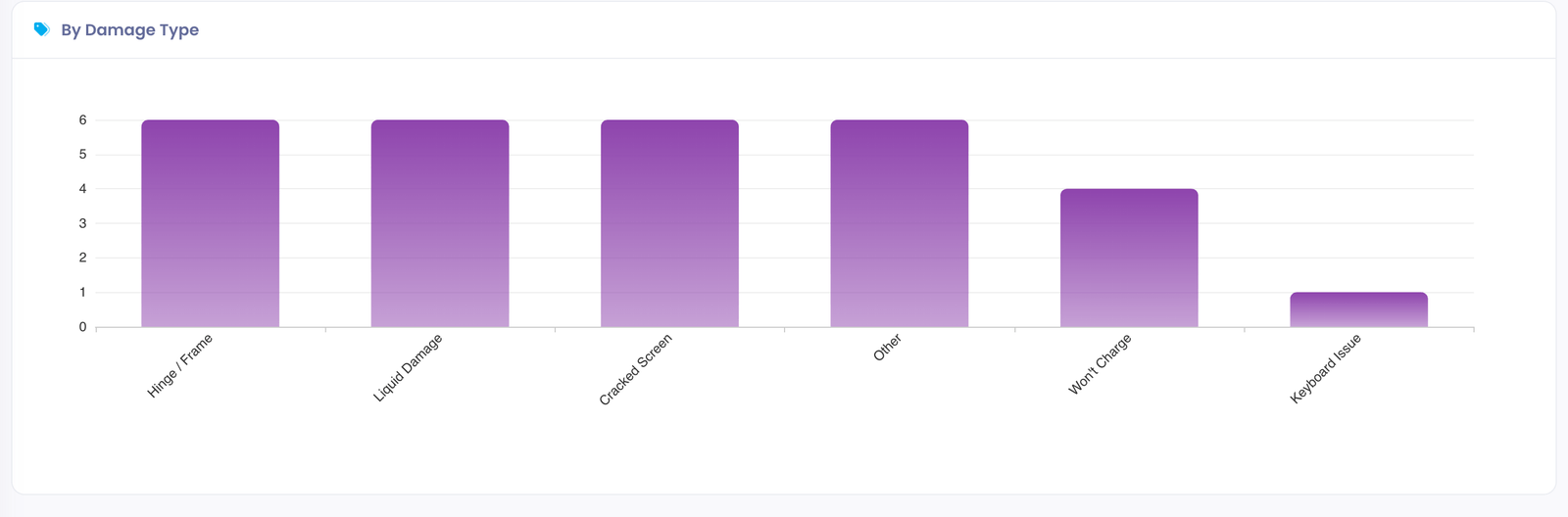
What it answers:
- Which specific issues are most common within a department
- Whether a particular failure type is trending
- Where to focus purchasing, training, or preventative efforts
Reading the chart:
- Each bar represents one answer value for the selected custom field
- Bar height (or length) shows the number of tickets with that value
- Tickets where the question was left blank are grouped as (Not answered)
Only dropdown and checkbox custom fields can be used for grouping, because they have a fixed set of answer values. Free-text questions are not offered in the Custom Field picker.
Summary Statistics
At the top of the report:
- Total Tickets: All tickets in the selected period
- Resolved: Tickets that were closed
- Open: Tickets that remain active
Exporting Data
Click the Export CSV button to download ticket data for external analysis in Excel or Google Sheets.
Technician Performance Report
This report measures individual technician productivity and efficiency.
Requires View Technician Performance permission. This permission is typically granted to supervisors and managers who need to review individual staff metrics.
Accessing the Report
Navigate to Support Center > Dashboard and click Reports > Technician Performance.
Available Filters
- Date Range: Select the analysis period
- Department: Filter by support department
- Technician: Focus on a specific staff member
Charts Included
Tickets by Technician
A grouped bar chart comparing assigned vs. resolved tickets per technician.
What it answers:
- Individual workload distribution
- Who is handling the most volume
- Resolution efficiency per person
Reading the chart:
- Blue bars: Tickets assigned
- Green bars: Tickets resolved
- Gap between bars indicates backlog
Resolution Rate
A pie/donut chart showing resolution rate comparison.
What it answers:
- Comparative efficiency across team
- Who is completing vs. accumulating tickets
- Team capacity utilization
Average Resolution Time
A horizontal bar chart showing average hours to resolution per technician.
What it answers:
- Speed of service per technician
- Who resolves tickets fastest
- Potential training needs
Color coding:
- Green: Under 24 hours (excellent)
- Yellow: 24-48 hours (acceptable)
- Red: Over 48 hours (needs attention)
Performance Leaderboard
A detailed table ranking technicians by resolution rate:
| Column | Description |
|---|---|
| Rank | Position based on resolution rate |
| Technician | Name and email |
| Assigned | Total tickets assigned |
| Resolved | Tickets closed successfully |
| Pending | Tickets still open |
| Resolution Rate | Percentage resolved (with progress bar) |
| Avg Time | Average resolution in hours |
Gold/Silver/Bronze badges indicate top three performers.
Using for Coaching
- Compare similar-role technicians fairly
- Consider ticket complexity (some departments have harder issues)
- Use as conversation starter, not definitive ranking
- Track individual improvement over time
Department Analysis Report
This report provides deep analysis of each department's performance.
Requires Help Desk Analytics permission. This permission provides access to supervisor-level reporting across departments.
Accessing the Report
Navigate to Support Center > Dashboard and click Reports > Department Analysis.
Available Filters
- Date Range: Select the analysis period
- Departments: Select one or multiple departments to analyze
Department Summary Cards
Each department gets a visual card showing:
- Total tickets received
- Resolved count
- Open count
- Average resolution time
Charts Included
Volume Comparison
Bar chart comparing total tickets across departments.
What it answers:
- Which departments are busiest
- Relative workload distribution
- Staffing alignment with demand
Resolution Time Comparison
Horizontal bar chart showing average resolution by department.
What it answers:
- Which departments resolve fastest
- Where bottlenecks may exist
- Process improvement opportunities
Color coding:
- Green: Under 24 hours
- Yellow: 24-48 hours
- Red: Over 48 hours
Daily Trend by Department
Multi-line chart showing daily volume per department.
What it answers:
- Department-specific patterns
- Correlated vs. independent demand
- Impact of events on specific departments
Hourly Activity Heatmap
Grid visualization showing ticket volume by day of week and hour.
What it answers:
- Peak support times
- Staffing coverage gaps
- When to schedule maintenance
Reading the heatmap:
- X-axis: Hours (0-23)
- Y-axis: Days (Sun-Sat)
- Color intensity: Darker = more tickets
- Green gradient: Low to Peak volume
Example insights:
- Dark cells at 9am Monday: Post-weekend issue surge
- Light weekends: Consider reduced weekend staffing
- Dark lunch hours: Consider coverage during breaks
Building Demand Report
This report identifies which locations generate the most support tickets.
Requires Help Desk Analytics permission. This permission provides access to supervisor-level reporting across locations.
Accessing the Report
Navigate to Support Center > Dashboard and click Reports > Building Demand.
Available Filters
- Date Range: Select the analysis period
- Department: Filter to a specific department
- Sort By: Volume, Resolution Time, or Open Tickets
Building Summary Cards
Each building gets a demand card showing:
- Demand indicator: High/Medium/Low based on volume
- Total tickets generated
- Resolved count
- Open count
- Average resolution time
- Demand percentage bar relative to highest-volume building
Insights Panel
Automatically generated observations based on your data:
- Highest demand building identification
- Buildings with most open tickets needing attention
- Fastest resolution location (best practices to copy)
Charts Included
Distribution Pie Chart
Shows ticket distribution across buildings.
What it answers:
- Relative demand by location
- Which buildings dominate support volume
- Potential outliers needing investigation
Top 10 Buildings by Volume
Horizontal bar chart ranking buildings by ticket count.
What it answers:
- Definitive ranking of highest-demand locations
- Scale of difference between buildings
- Resource allocation priorities
Weekly Trend by Building
Line chart showing daily volume for top 5 buildings.
What it answers:
- Building-specific patterns over time
- Correlated vs. independent issues
- Event impact by location
Grade Level Distribution
Bar chart showing tickets by grade level.
What it answers:
- Which grades generate most requests
- Age-specific technology challenges
- Training needs by student age
Acting on Building Demand Data
High demand buildings might need:
- Dedicated on-site support presence
- Additional device training sessions
- Infrastructure improvements
- Equipment upgrades or replacements
Low demand buildings might indicate:
- Effective local tech support
- Better trained users
- Higher quality equipment
- Best practices to replicate elsewhere
Exporting Report Data
All Help Desk Reports include a Export CSV button for downloading data.
Export Format
CSV files include:
- All relevant ticket fields
- Filter criteria applied
- Ready for Excel/Google Sheets analysis
Common Export Uses
- Monthly reporting: Generate data for stakeholder reports
- External analysis: Create custom charts in Excel
- Historical records: Archive data for year-over-year comparison
- Compliance: Documentation for audits or reviews
Best Practices
Regular Review Schedule
- Weekly: Check Technician Performance for coaching opportunities
- Monthly: Review Volume trends and Department workloads
- Quarterly: Analyze Building Demand for resource planning
Actionable Insights
- Volume spikes: Investigate root cause, consider self-service options
- Long resolution times: Review processes, consider training
- Unbalanced workloads: Redistribute staff or adjust assignments
- Building hotspots: Deploy additional resources or investigate issues
Presentation Tips
- Use date filters to match reporting periods
- Export data for custom visualizations
- Screenshot charts for presentations
- Include narrative explaining the numbers
Common Questions
Q: How current is the report data? Reports query live data and reflect current ticket status. There may be brief delays for newly created tickets.
Q: Can I schedule automatic reports? Currently, reports are generated on-demand. Use the Export CSV feature and set calendar reminders for regular reporting.
Q: Why don't I see certain buildings or departments? Reports only show data you have permission to access based on your administrator role.
Q: What defines "resolved" for these reports? Resolved tickets are those with a status marked as closed or completed in your ticket status configuration.
Q: How is average resolution time calculated? The time from ticket creation to when it was moved to a resolved status, averaged across all resolved tickets in the period.
Q: Can I customize which charts appear? Report layouts are predefined. Export data to create custom visualizations in external tools.